Making more backgrounds for doll photography
Hi everyone! How is your summer going so far?
A few days ago I did my finals for college, and I think it went pretty well, despite I won’t have the results until early July. Now I have a couple of months of holiday until the next semester starts. I think I deserve the holiday, I worked my butt off for over 6 years working full time and studying at night. Hopefully, next year it will be my last year at college and I will be able to focus on “just” working.
During winter, I’ve come up with quite a few ideas for the blog, most of them doll photography related. I’m planning to boost my Instagram account this summer, as well as working on my photography skills. We’ll see if I have time to do all the things that I have planned.
Today’s post is also photography centered, as I’m working on some new doll photography backgrounds. A couple of months ago I wrote a post in which I summed up some background ideas for your doll photos (see it here). This is a little bit like “part 2” for that post. In a Twitter conversation with Fashion Doll Stylist, she gave me a couple of great ideas for backgrounds, but I will put them in a future post, as I don’t want this one to be too long. Also, in this one I wanted to focus on super simple things that anyone can do, as well as give you the chance to use things you may already have at home. Being that said, let’s start.
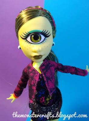
As you may know at this point, I always use big sheets of cardstock paper for my photos. I have them in solid colors and also with glitter. But something I had never done before is put two of them one on top of the other, to create a 2 color background. It’s so simple that I don’t know why I hadn’t thought this before. Here’s Amanita.
And this is how I set everything up:
For my lights, I cover regular desk lamps with tissue paper, as I don’t have soft boxes. Cheap, but my lightning looks better since I learned that trick.
You can always make a different background by changing the doll’s position, the cardstock layout or change one of the colors.
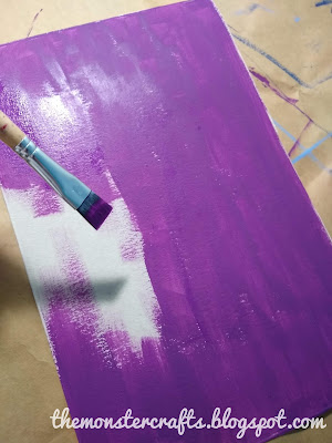
The only problem that I had with cardstock paper is that the color selection was quite limited. I wanted certain shades that I couldn’t find, as well as cardstock with prints. I live in a small town and sometimes finding interesting or different things is an odyssey. So that’s why I decided to paint my own using a cereal box and some craft paint. Yes, the size is quite small, but I can’t imagine myself painting a huge sheet of cardstock. Maybe I could use spray paint, but I know that not many people like painting with spray paint and I wanted to keep it beginner- friendly. No many indications are needed here, just paint straight onto the non-printed side of the cereal box.
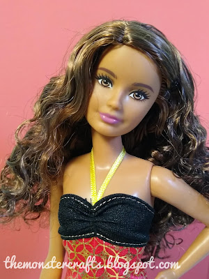
I wanted like a peachy/ coraly color for a background, so I used this color from Americana called “Coral Blush”. For some reason, it doesn’t look as vibrant on camera as it does in real life, but that happens with some colors. Here’s Courtney, aka “Crazy for Coral”.
I also wanted a vibrant purple, so I grabbed an acrylic from LeFranc in the shade “Bilberry”. I know that LeFranc is supposed to be a really good brand, but this one didn’t go on as smooth as the Americana one and still looked patchy after 2 coats. I don’t know, maybe it’s because I’ve had this one for quite some time. Also, when it dried down it didn't look as vibrant as I expected.
If the width of the cereal box is an issue, you can always put it in horizontal position.
You can still see a little bit of the patchiness in here, but Casta Fierce looks great against this color.
Here are both of the colors that I used, just in case you find it helpful.
I also had these two colors from an Spanish manufacturer called Titan, that I don’t know if it’s available in your area.
This product, called Acualux, is quite good, specialy the matt formula. However, this ones are satin and, and I wanted my backgrounds to be matt, so I mixed the green one with a matt medium to matify it. Wrong. It was very hard to apply and it looks a little bit patchy. However, you can barely see the patchiness on camera.
When I chose this two colors, I had Howleen Wolf in mind. She’s one of my favorite dolls from Monster High, and I really like taking photos of her. Her bright colors make her so interesting and fun. I think she looks great in this photo, and also you can barely see the shine of the satin finish.
I also wanted to try a metalic finish paint, because I wanted to see if it would show on camera and how would the light reflect on it. I chose this copper color from the brand Amsterdam. Again, the paint felt very thick and didn’t spread well, but I’ve also had this at home for quite some time. However, I don’t mind the patchiness here, as I think it will give it a looked of brushed metal.
It looks quite good on camera, as it gives some texture to the background. What do you think?
Originally, I just wanted to do a couple of backgrounds in solid colors, but at some point I thought it would be fun to do a splattered paint type of background. It takes a couple more steps, but it’s very easy. Start with a solid color background. I chose to do mine in black.
Then pick some colors, thin them with water to make them more liquid, and start splattering them on your surface. I would recommend to use contrasting colors, as they will show up more. Sorry for the terrible photo, I took it myself with one hand. Now I realized I could have used my tripod.
And here is the result. You can make this on top of cardstock paper as well (which I thought after I had painted my piece of cereal box). I think it looks quite good on camera.
I think that’s enough for one post. I have more ideas in mind for backgrounds, and I’m planning to do a tutorial style post about them. Definitely let me know which background did you like the most as well as suggestion for future posts in the comment section. I've been also thinking of doing "themed" doll photography posts, with, for example, a color story or a motive, such as wood, or nature. Also, if you have Instagram or Facebook , feel free to follow me there too.
Blog to you soon.
M.C.


Great post!!! I LOVE the spattered background!!!
ReplyDeleteThanks! I'm planning to do a couple more with that effect, but also I want to try other techniques.
DeleteAll of your backgrounds look fantastic! It really helps highlight a doll or dolls, to have a nice backdrop.
ReplyDeleteHi Barb! Thank you. I agree, the right color just helps to enhance a doll's features, while the wrong one might wash her off. Thanks for always reading my posts.
DeleteLooking really good MC. I always enjoy seeing people experimenting with their projects.
ReplyDeleteBig hugs,
X
Thanks Xanadu. I love experimenting, and I also love painting, as it relaxes me a lot. I've done another splattered background that I will show in my next post.
DeleteThanks for stopping by.
sorry I was on holidays in paradise (with my kid & kidlets :)) I missed this post. you did a lovely job I love those background so very versatile plenty of great ideas that can be applied for my big girls as well (I only change the size of the board) I love that splattered one as well.
ReplyDeleteHi Dom! Thanks for taking the time to keep up with my posts. I'm trying to find something that's bigger to have a bigger surface, but that's easy to find and to work with aswell. The splattered one is one of my faves too.
DeleteHope you had a great time with your family.