Behind the scenes: inspired by Barbie Style
If you follow my Photo compilation posts, you'll know that lately I haven't been very inspired to take doll photos. I've had some ideas here and there, but I haven't had that spark that made me super inspired, or felt that tick that made me want to drop everything that I'm doing and start taking doll pics. But that changed around a week ago.
A while back, I saw on @barbiestyle a photo that triggered an idea. It was a rather simple photo, but I thought I could recreate it or use it as an inspiration for a photoshoot. I haven't been very inspired recently so, a few days ago, I decided to give it a try. Down below, you can see the photo in question. If the embed code doesn't work for you, you can always follow this link to the Barbie Style Instagram page.
This isn't Barbie Style's best photo or my favorite, but for some reason it sparked the idea. Maybe it's because I noticed that the photo composition was rather simple. Also, you might understand now why I wanted to recreate that artwork on my last post. Keep in mind that I'm not going into this trying to recreate a 100% identical replica, but rather to use this as a base for photos that have a similar feel or vibe to them.
Before we start, I want to point out something very important. Photography isn't easy, and it's not easy for me. For each photo that I publish because I liked, I had another 20 that I thought weren't good enough. Not just for this project, but any other photography project. It takes a lot of time to get a project done, sometimes several days. I say this because I don't want anyone to feel discouraged if they try to recreate this and doesn't work out at first. It does take time, and sometimes you just need to figure out what works best for you. I'm also not talking from an expert point of view, but rather sharing my journey and how I approach my projects.
So, let's start with the actual tutorial. If you pay attention to the photo, you will see that there are some shadows that look like the sun is coming through the window. So, to achieve that, we need to create something that will cast a similar shade. For that, I'm using a cookie box that's not too big. Cut it open and use one of the sides to plan out your design. Mine has an embossing, but that isn't too important.
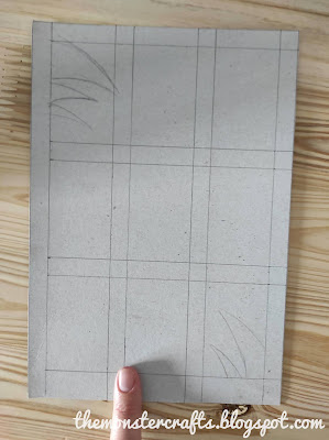
I started drawing a 90º angle, and from there I started planning out my design. I left 1cm (0,39 in) margin on the left and right sides. Starting from the top, I drew lines at 1,5cm (0,59 in) distance.
This is what we have. There's some extra space at the bottom, but that doesn't really matter. The lines that I've marked with my pencil are the ones that I'm going to cut out.
Start cutting out every other space using a cutter or a pair of scissors. If you use scissors, but you'll have to tape the cuts you make onto the sides, or it will fall apart. After cutting the first one with scissors, I continued with a cutter.
This is what we got. Don't worry if it looks rough, it's not going to be seen on camera.
Now it's time to set up the diorama, which is rather simple. I sticked some white card stock paper to the back for the wall. Then, I covered one of the BMR 1959 boxes with some white fabric I got to make doll clothes to be the bed. Finally, I just added the painting and a miniature potted plant. I'm using two clothes pins /clothes pegs to hold the grid in place.
At first, I used a desk lamp, but I didn't manage to get a defined shade on the photos, which I did get in a test photo I took earlier. So, I came up with the conclusion that the light from the desk lamp was too diffuse, so I needed something harsher. So, I thought I could use a flashlight or, in my case, the flashlight function of an old phone.
It took me a while to figure out the lightning that worked out the best for me. I tried everything: natural light and the flashlight, using my ring light in different intensities, home lights... I don't recall the combination I used here, but I wasn't very happy with the result, and the pose feels unnatural to me.
 |
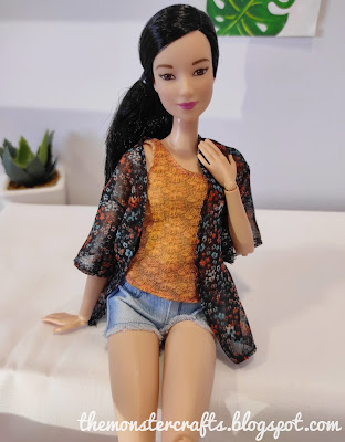
Finally, I came up with a mix of the flashlight, some natural light and very dimmed light from my ring light in a warmer temperature that I would normally use. These photos were taken in the afternoon, between 3 pm and 6 pm, when the sunlight doesn't hit as directly on my window. It also took me a while to get a hang of the poses, and this was one of the first photos I was really happy with.
I took some photos with Lea too, and I was way happier with those than the ones I got with Chloe.
I noticed that my photos don't have such a harsh contrast and defined shade as the one on Barbie Style but, to be honest, I didn't like the ones that had a harsher line. I think that I'm so used to taking very luminous photos, that the ones that are darker didn't feel as nice as the brighter one.
Those were the photos that I took on a Friday afternoon. A couple of days later, I revisited this and tried to get a few ideas that I still had on my mind and some back-ups in case these weren't good. I also drew a new grid, this time trying to mimic a window.
I left 1 cm space between the rectangles to create window panels. I also decided to get adventurous and draw some leaves on the top and bottom corners. This is going to be fun to cut out.
Here's the finished result. As soon as I finished cutting it, I knew I should have drawn bigger leafs on the top part. Plus, the cuttings I made are quite messy, but we'll give it a try anyway.
It was hard to get the leaves to appear on camera, so I had to turn and flip my grid until they made an appearance. I do like this photo, except for the fact that the painting looks crooked, because I was paying more attention to the doll's face than the background.
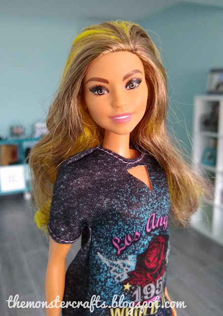
From all the photos I took the second day, this photo of Victoria is one of my favorites. I did manage to get the leaves on the top part of the photo and I love the overall composition.
Bottom line, I'm not sure if I achieved what I originally wanted to do, but despite that, I like some of the photos I got. I think that the way to learn doll photography is by practicing doll photography. It is still far from perfect, but by trying something different to what I normally do, I challenged myself and I learned something new. I am quite happy with the result, but there's still room for improvement. This project is part of the photography journey, not the final destination.
I also think that I should mention that I have a new computer monitor, and I'm still getting used to the colors. Editing is a bit harder with it, but using the laptop was giving me so much neck pain that I really need to use it. I hope I can get that figured out soon, but for now there might be a few photos that look a bit "off".
I have a bunch of projects planned for this summer, including a wall that I started months ago, which I'll probably try to finish up next. I also want to do some outdoor decor for my outdoors scenes, but I still need to get some supplies for that. For early July, I'm planning a photo compilation and a recap of the first half of the year: what have I accomplished and future plans.
So, what do you guys think about this project? Let me know your thoughts in the comment section and I'll see you on my next post.
Monster Crafts


I think it was very ambitious to take pictures like Barbie professional ones, and I think you got some great results. I admire your willingness to try more difficult projects. A lot of times, I just go for quick and easy.
ReplyDeleteHi Barb! It was ambitious, but I didn't expect to get the exact same result, since I don't have professional gear or professional skills. But it was fun trying to figure out how to do it and get resourceful. I'm not gonna lie, I often go for quick and easy too, but sometimes I just have the motivation to challenge myself.
DeleteHello! Sometimes we all feel just like that, for different reasons. We need to focus on something else or just take a break, and that is great in this hobby, that you can do so and come back with more energy.
ReplyDeleteGreat way to get some inspiration. I have saved some photos on my smartphone for future ideas. Mostly clothes, patterns and color themes. It can be the most simple things that just give you the energy you need.
Photography is hard, but I think that the photos you have taken and shared on this blog has been great. I still use my smartphone and want to learn so much with tricks and other things one can do with the camera in a phone like that. It is important to let it take time and learn from ones mistakes. Easier said than done, I know so.
Love the tutorial. Easy steps and with an amazing result. It is great to see even the photos you did not feel happy with. Even if the pose felt unnatural to you, I think it was a lovely photo.
I am like Barb, go for the quick and easy. I should let that go and test something new.
Hi Niina. Thanks, I'm glad that you liked them. I also use my phone to take photos, I feel it takes better photos than my pocket camera and it's easier for me to hold the phone with one hand and the doll with the other. You can get nice results with a phone, as far as it has a decent camera.
DeleteYou are right about having to take a break. I was taking photos so often to post on Instagram that I got burned out, so I decided to slow it down. That way I've got some time to work on other stuff and get creative again. Now I'm having plenty of ideas that I can't wait to start working on.
I'm glad that you found the tutorial useful. I like to share even my mistakes, so people get to learn from them. I sometimes also go for the quick and easy, but I felt like I needed to challenge myself.
Thanks for stopping by.
Hey MC... I love the outcome of your experiment! Indeed, it is the only way to learn photography, and that is to practise it. My first doll photography experience was when I needed to do it - I had to have photos of my work on Etsy, else I won't sell, right? But it was all too simple, with no staging involved. Now, I had become super ambitious with staging and all, and even sometimes dreamt of having a diorama box that I will use forever for my doll photography. But after reading your blog, I am reminded that you can still take pictures with just combining things here and there, and that a grand diorama box isn't really all necessary. Thanks so much for that! Thanks so much for your inspiration and creativity!
ReplyDeleteHi Shasha! Thanks, I'm glad you liked it. I've always thought that your photos are great, you have a very personal style. I do understand (and relate) getting ambitious, which isn't bad, but can get in your way. I also have ideas for permanent dioramas, but as for now, I just don't have the resources to make it or the space to store it, so I use temporary scenes. Just because something is simple, doesn't mean is bad and you can get nice results with just a few elements.
DeleteThank you so much for your kind words! I'm glad that my post inspired you.
I really like your photos and I understand you when you try to improve your photography. Me too I do not find my successful photos, I try to improve myself but I do not succeed. But it is true that it is by taking more photos that we will improve.
ReplyDeleteHello Shasarignis! I recognize you from Shasha's blog. I have felt that, that I'm not improving and that my photos aren't good compared to others, but that's not true. I'm sure that, if you take a look at older photos you took, you will see some improvement. Even if you're not at the point you would like to be, don't feel defeated and just keep trying. Remember that this is a hobby, and the most important thing is to have fun.
DeleteThanks for stopping by.
Thank you 🥰
DeleteYou're welcome dear!
DeleteYou really ar an inspiration to us all MC. I agree with Barb's comment entirely so I am not going to repeat her points. However, your post receives a well done from me, I hope you keep on enjoying your life with dolls and continue to share your wonderful ideas which help us to improve our photography.
ReplyDeleteBiggest hugs,
X
Thanks Xanadu! I don't think I know more about doll photography than others, but I try my best to make the most with what I have. I'm glad that you all seem to like the photos. I'm quite happy with them and I want to give this idea another try.
DeleteThank you so much for your kind words. Big hugs to you too.
This is a brilliant idea. And something that is simple (now that you have figured it out for the rest of us). It is almost like creating a shadow box then using it to create a mood behind the doll. I've gotten a bit lazy with my backgrounds, so I'll be sure to bookmark this page and come back to it because this is a great idea. I too, have to play around with the lighting. I generally use natural daylight. But that restricts me to only doing photo shoots during the day. Big hugs!
ReplyDeleteThanks April. It's a fairly simple concept, but playing around with lightning is not that easy. I'm not the best when it comes to control lighting, but this was a good idea to practice. The shadows help fill the empty space and give the illusion that there's something in front of her. I'm glad to hear that you found this post inspiring and that you'll be revisiting it for future projects.
DeleteBig hugs to you too.
This is so cool. :) I love the way the photos turned out in the end.
ReplyDelete-Quinley
Thanks Quinley!
Delete