Pop of color
Hello everyone! Have you enjoyed your weekend?
I must confess that I'm not working on my crafts as much as I should if I want to build a doll cafe at some point during this century. I don't have much free time, so I work on this blogs mainly on sundays and bits of time here and there. Besides some doll crafts, I have a frankendolly project on mind, but before starting it I'd want to do a couple more reviews.
Today I haven't done a review, but instead, I've been taking some doll photos. I'm not the best doll photographer and I don't have a professional camera or studio to work, but I like to experiment and try to improve. As you may have noticed at this point, almost all of my photos have the same navy blue background, so today I tryied to add more colour to my photos. I used wall paint color sample sheets that you can get at a paint store (because I work in one, so I could just borrow them), but you can use colored cardstock as well.
 I like how this dark turquoise green looks on the pictures, and it seems to flatter the dolls, but it doesn't make such a difference from the navy blue.

This light lavender color is very nice, but it looks very white in the picture, specially when I tried to photograph dark skin dolls.

"Crazy for Coral" is cute, but she doesn't look that great against this colour.

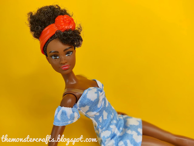
Yellow is one of my least favourite colours, but I think it really brought light to the pictures. I think that it specially flatters Asha.

Also Teresa looks fantastic against this color. By the way, the name of this color is "Extreme Honey"

The L.A Girl doesn't look bad on it, but I feel that it flatters dolls with darker skin tones better.

With the light grey I had the same problem than with the light lavender, it does look very pale, and also it feels very dull.

This cherry red is, for me, the colour that flatters the dolls the most. Raquelle looks great against it.

And it really flatters Grace:

Because Mr. Monster complains about the lack of Monster High dolls on this blog lately, I decided to invite Clawdia Wolf to the photoshoot.

I still have more sample sheets to try, but this it for now. One of the most difficult things for me is to take pictures of the dolls with rooted lashes, because sometimes I can't see if they're "looking" to the camera. Also, I'm not very creative with poses and I don't know what to do with the doll's hands besides puting them on their hips.
I hope you guys enjoyed my pictures as much as I enjoyed taking them. I'll be back soon with another doll review.
Also, I like to remind you that we can stay connected on Facebook and Twitter, specially during non-blogging periods.
M.C.
I must confess that I'm not working on my crafts as much as I should if I want to build a doll cafe at some point during this century. I don't have much free time, so I work on this blogs mainly on sundays and bits of time here and there. Besides some doll crafts, I have a frankendolly project on mind, but before starting it I'd want to do a couple more reviews.
Today I haven't done a review, but instead, I've been taking some doll photos. I'm not the best doll photographer and I don't have a professional camera or studio to work, but I like to experiment and try to improve. As you may have noticed at this point, almost all of my photos have the same navy blue background, so today I tryied to add more colour to my photos. I used wall paint color sample sheets that you can get at a paint store (because I work in one, so I could just borrow them), but you can use colored cardstock as well.


This light lavender color is very nice, but it looks very white in the picture, specially when I tried to photograph dark skin dolls.

"Crazy for Coral" is cute, but she doesn't look that great against this colour.

Yellow is one of my least favourite colours, but I think it really brought light to the pictures. I think that it specially flatters Asha.

Also Teresa looks fantastic against this color. By the way, the name of this color is "Extreme Honey"

The L.A Girl doesn't look bad on it, but I feel that it flatters dolls with darker skin tones better.

With the light grey I had the same problem than with the light lavender, it does look very pale, and also it feels very dull.

This cherry red is, for me, the colour that flatters the dolls the most. Raquelle looks great against it.

And it really flatters Grace:

Because Mr. Monster complains about the lack of Monster High dolls on this blog lately, I decided to invite Clawdia Wolf to the photoshoot.

I still have more sample sheets to try, but this it for now. One of the most difficult things for me is to take pictures of the dolls with rooted lashes, because sometimes I can't see if they're "looking" to the camera. Also, I'm not very creative with poses and I don't know what to do with the doll's hands besides puting them on their hips.
I hope you guys enjoyed my pictures as much as I enjoyed taking them. I'll be back soon with another doll review.
Also, I like to remind you that we can stay connected on Facebook and Twitter, specially during non-blogging periods.
M.C.


I think I like the red background the best too!
ReplyDeleteYou know what they say, great minds think alike ;)
DeleteHow cool that you can experiment with backdrops! The cherry looks best indeed. Can you get more colours? I think something calmer, like a maroon or would be even more suitable. My bedroom is painted a kind of lavender, but it's darker and warmer than your sample. Most dolls photograph fine on it. Maybe if you could get more neutral colours (like browns, mauve, brick, khaki, taupe - but not light grey) it would be less tricky to match the background to the doll.
ReplyDeleteYes, I can get as many as I want (all the 224 colors), but I have to return them to the shop because that's for the customers to take (and we charge for them). Today I have picked a chocolate brown and a dark purple. I want to take a more beige color and mauve, but first I have to return the ones I have. I'd also love to have a bright green, but the greens in this particular color chart look quite dull. In general, the colours look lighter in the picture, even the yellow looks more intense in person.
DeleteThe good thing about this, is that I can experiment with background colours without having to spend money. For example, now I know that I like the cherry red, so I can get a coloured cardstock in a similar colour knowing that it will look good.
Thanks for stopping by!
I remember way back in the olden days when I first started using computers, the use of red in photographs looked rather horrible due to the nature of CRT screens. Now that LCDs have taken over that's really a non issue but I still rarely use red as a color in photos. Based on your pics I should remedy that because it looks awesome in your photos!
ReplyDeleteThanks Muff! I think that it also depends on the shade of red that you choose, this one is a darker red, more like cherry color. I remember my first laptop, that had a resolution that was beyond horrible. I did things that looked great on it, but when I put them on a different computer, the colors were totally different.
Delete